Patient Management for Mobile
Simplified ordering, faster scheduling, and fewer errors for a seamless order lifecycle
NuVasive, Inc.
UX Design Lead
MY ROLE
On this project, I was the Lead UX Designer. I conducted user research, created the interface, and defined the user experience. I collaborated with product managers, developers, and stakeholders to craft the final product.
BACKGROUND
The Atlas app at NuVasive had different sales tools for managing orders, scheduling, reporting, and billing. However, these tools were separate and didn't work together. Sales teams struggled to coordinate surgery orders and wanted a single, user-friendly tool to access all the necessary information to manage a case.
TEAM
Product Manager
Software Engineers
Leadership
GOALS
Simplify the Ordering Process
Combine several separate processes into one streamlined flow, giving teams a holistic picture of an order lifecycle.
Speed Up Ordering Time
Speed up the time it takes to schedule and bill for a surgery so sales teams can be more present in the OR.
Reduce Order Mistakes
Reduce costly errors during the billing process.
PROCESS

Research and Discovery
Interview Sales Reps to understand current process flows and user mental models.
Design
Create wireframe flows based on user feedback. Create prototype of the design.
Validation
Test the prototype with users and iterate based on feedback.
RESEARCH FINDINGS
Editing and Updating Orders
Many times the surgeon will change their minds on which products they want to use for a surgery and there is no way to change an order once it’s submitted.
Guidance and During the Billing Process
Most of the time the billing for surgeries is incomplete and contains errors because it’s a confusing process.
Order Tracking
It’s not easy to see the status of an order and when it will arrive.
Disconnected Processes in the App
Too much back and forth when trying to manage a case.
USER WORKFLOW
Now that I had thoroughly grasped the unnecessary steps, identified opportunities for improvement, and pinpointed the pain points in our current processes, I was able to thoughtfully design and implement new optimized processes that seamlessly aligned with the workflow of our users.
SKETCHES
I began the design process with whiteboard sessions with a couple of our Sales Reps to accelerate the design conversation through visualization.
WIREFRAMES
Using Axure, I translated our sketches into low-fidelity wireframes. At this stage, the wireframes were defined enough for some user testing. I reviewed the wireframes with users and iterated to resolve any usability issues.
MOBILE DESIGN
Statistically, most of our users were using iOS devices in the field but there was also a percentage of Android users. Also, we did not have a design system or pattern library in place.
Based on this information, I decided to base the design off of Material Design and NuVasive branding guidelines to style the app.
I created an interactive prototype using Justinmind.
USER TESTING
I tested the prototype with real users and found several problems. With that feedback, I improved the design.
Labeling
The tab labels of Pre-Op vs. Post-Op were confusing. They tend to think of a surgery as either scheduled or past.
We should be using the term “patient” instead of “case” management.
Shopping Cart
They do not understand the concept of a shopping cart. It's just more clicks to complete an order.
Billing
The Charge Sheet process didn’t make sense to users. There are items that are ordered and then items that are billed for.
OUTCOME
While most of the usability issues were resolved in user testing, there was just one hiccup with the Charge Sheet and Billing design that was a sticking point for our users. The items brought into the case vs the items billed for needed to be more distinct from one another. I worked with the product manager to dip back into our research and quickly iterated on the design. After a few rounds of user validation with our user group, we managed to come up with a solution.
More Time for Research: I would also add that in retrospect, we really needed to bake in more research time from the beginning. In addition, having more time to do a Journey Mapping exercise would have cleared up many disconnects within the team on process flows and sticking points.
Communication: The systems were really complex and hard to understand. To make it more confusing, many people used different terminology for the same exact things. It would have helped to find a common terminology among the team.
RESULTS:
Simplified Ordering Process
We now have one continuous process for following a surgery's journey from booking to submitting the bill of materials.
Ordering Time Decreased
The time to manage and complete orders decreased significantly.
Reduced Order Mistakes
Our customer service team saw a dramatic reduction in billing errors and order issues and completion.

Sales Rep Experience
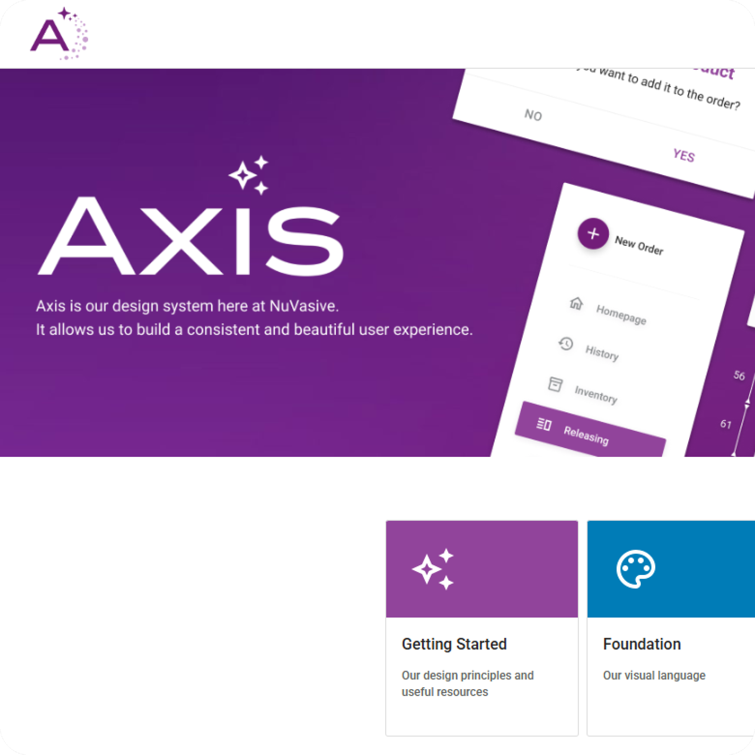
Axis Design System
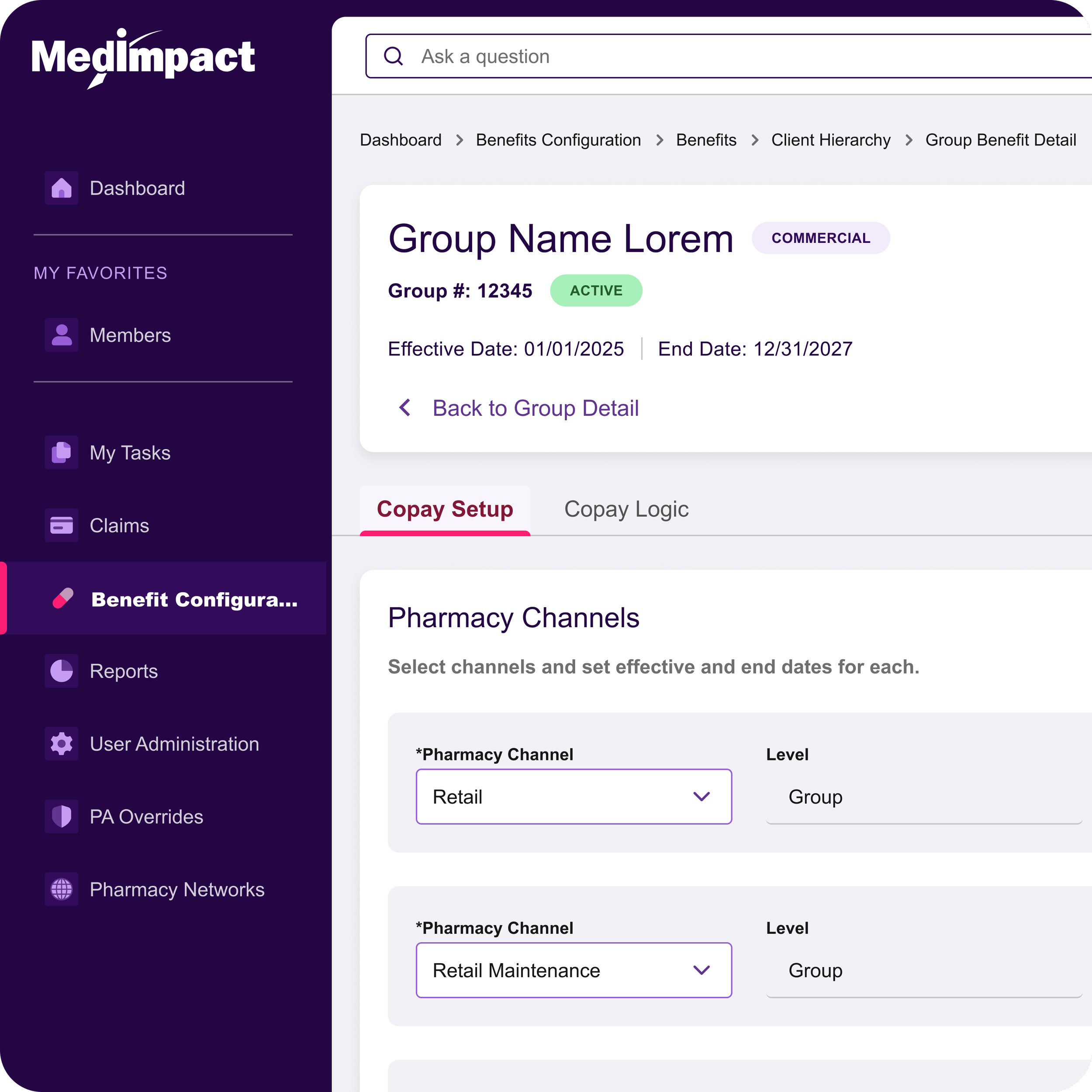
Copay Configurator

Atlas One

Atlas Japan

Patient Management