Copay Configuration for Web
A greenfield benefits-configuration experience for PBM analysts and reviewers
MedImpact | MedCommand (Leapfrog) Project
Senior UX Designer


-69%
Median configuration time
-52%
QA findings per config
~8s
Reviewer time-to-answer
SNAPSHOT
Copay Configurator is a greenfield feature built for MedImpact's MedCommand platform (code name: Leapfrog) that allows pharmacy benefit analysts to define, edit, and review copay structures for client health plans.
The tool reduced median configuration time from ~45 minutes to ~14 minutes and cut QA findings by 52% during initial rollout. Lovable AI was used throughout the design phase to brainstorm concepts and generate interactive prototypes, compressing weeks of mockups into hours of conversational iteration.
PROJECT AT-A-GLANCE
Role: Product Designer (end-to-end)
Team: 1 Product Designer, 2 BSA, 1 Product Manager
Tooling: Figma + Lovable AI (concept brainstorming + interactive prototyping)
Timeline: 8 weeks (design + prototyping)
Platform: Web app (desktop-first, enterprise)
The Business Problem
MedImpact administers pharmacy benefits for health plans and employers. Every client plan requires a copay structure that determines what members pay out-of-pocket for prescriptions across multiple pharmacy channels (Retail, Mail, Specialty, etc.).
Before this project, analysts configured copays through a combination of spreadsheets, manual ticket handoffs, and backend data entry. There was no unified UI for building or reviewing these structures. Errors were caught late in QA, and turnaround time for new client setups was a bottleneck.
Why It Mattered
Copay structures are high-stakes configurations. A single misconfigured tier or incorrect day-supply range can directly impact member costs and client contracts. The business needed a single source of truth that analysts could configure accurately and reviewers could audit quickly.
Domain constraints
One copay structure per client — no multi-structure management needed.
Seven pharmacy channels, each with independent effective/end dates.
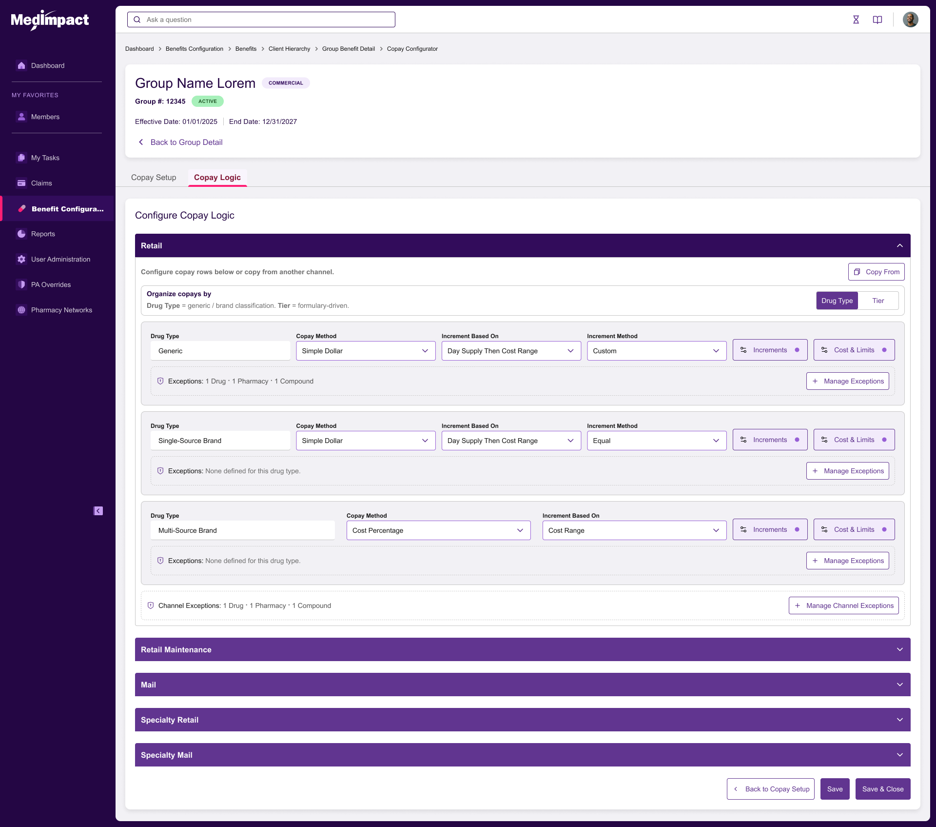
Drug Type channels require exactly three rules: Generic, Single-Source Brand, Multi-Source Brand.
Tier channels require at least one tier, with sequential auto-numbering.
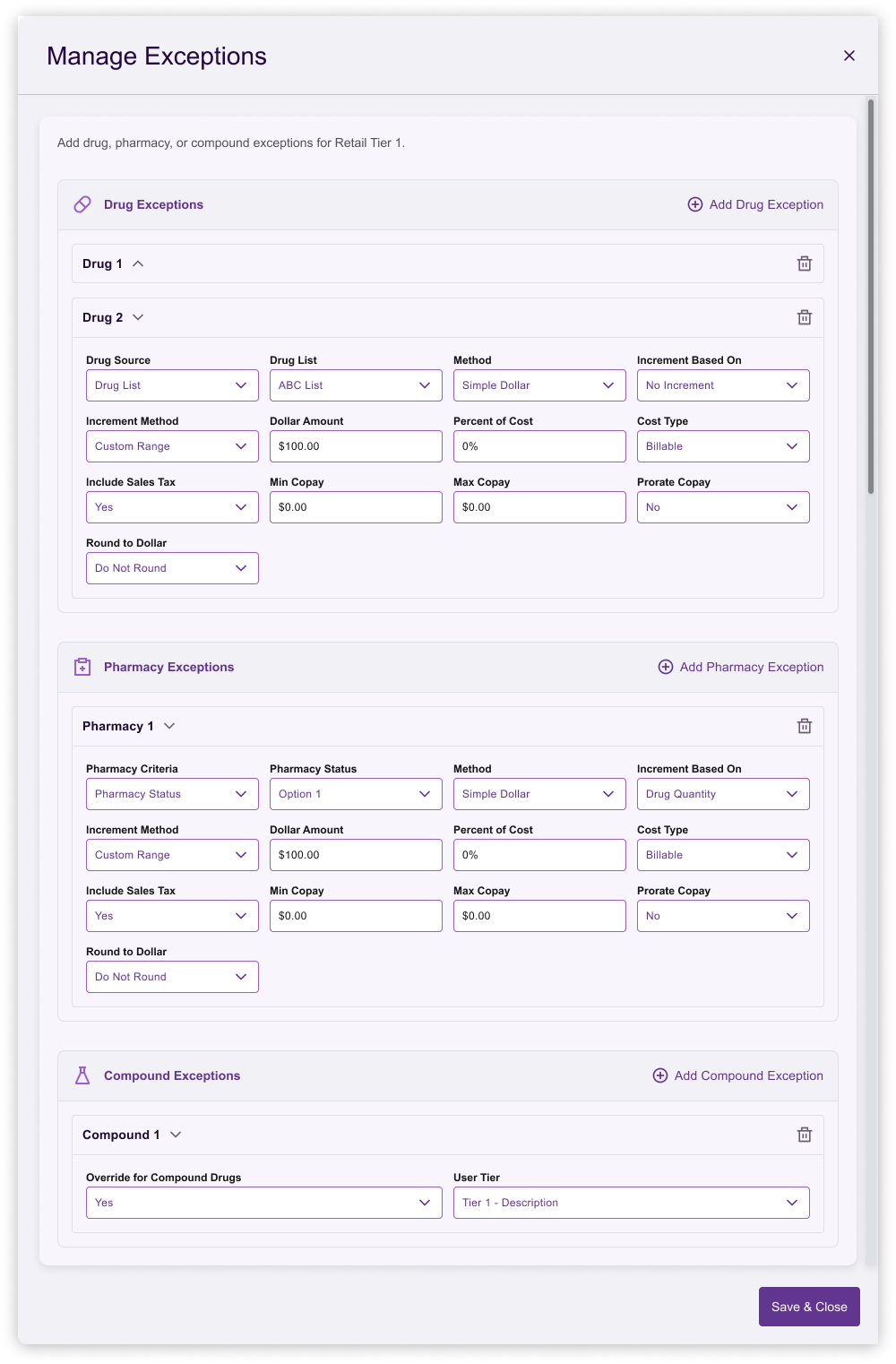
Rules support two levels of exceptions: channel-level and rule-level.
Increment logic can be flat or custom (day-supply ranges with nested cost ranges).
RESEARCH METHODS
6 contextual interviews with subject matter experts (SME’s)
Review of 12 real copay configuration spreadsheets to understand field usage.
Competitive review of PBM admin tools (internal legacy systems, competitor demos).
KEY INSIGHTS
Analysts think channel-by-channel, not rule-by-rule. They configure Retail completely before moving to next channel.
Exceptions are common but scoped: some apply to an entire channel, others to a specific drug type.
Reviewers need a fast-scan read-only view. They verify; they do not edit.
Custom increment tables were the most error-prone part of the legacy spreadsheet workflow.
No existing UI existed for this workflow — the feature was entirely greenfield.
PROBLEM STATEMENT
How might we give analysts a fast, accurate, auditable way to build copay structures from scratch, while giving reviewers a dense, scannable summary — all within a single-client, channel-first mental model?
Success Metrics
Reduce median configuration time from >40 min to <20 min.
Reduce QA-reported configuration errors by 40%.
Enable reviewers to answer targeted rule questions in under 15 seconds.
User Personas
Analyst (Builder): Configures copay structures daily. Needs speed, validation, and guardrails.
Reviewer (Auditor): Verifies structures before go-live. Needs density, status indicators, and side-by-side comparison.
PROCESS AND ITERATION
Brainstorming and Prototyping with Lovable AI
Lovable AI served as a design thinking partner across the entire project. I used it to brainstorm layout patterns, pressure-test domain invariants like locked rule sets, and generate clickable prototypes within the same conversation. Instead of producing static Figma mockups and waiting on engineering spikes, I was able to put working interactive prototypes in front of analysts and reviewers in the same week.
This accelerated the design process in three concrete ways: (1) divergent exploration of layouts (wizard, accordion, tabbed editor, inline editor) took hours instead of days; (2) the pivot away from the wizard happened against a real, navigable prototype rather than a static flow; and (3) the two-level read-only summary was validated with users before any production code was written. Net effect: roughly one design sprint compressed into a few focused sessions.
Early Direction: Wizard
The first prototype used a multi-step wizard (Setup → Logic → Review). Testing revealed friction: analysts wanted to jump between channels, and the wizard forced a linear flow that did not match their mental model. We killed the wizard.
Pivot: Inline Editor + Read-Only Summary
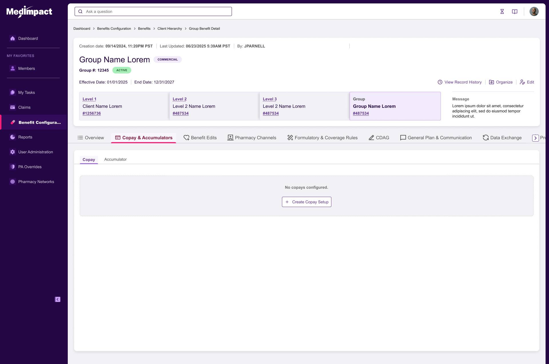
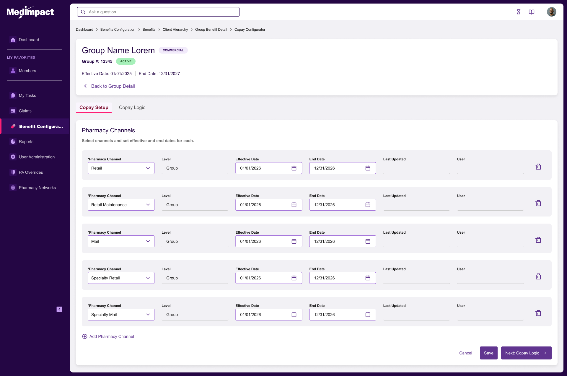
Replaced the wizard with an inline editor where all seven channels are visible and editable on one page. A separate read-only summary page (accessed from the Group Details Copay tab) provides the reviewer view.
Design Decisions Tested
Per-channel organization (Drug Type vs. Tier): Validated. Analysts preferred choosing per channel rather than setting a global default.
Rule-level popovers for Increments and Amounts & Limits: Validated. Contextual editing with clear channel/rule headers prevented mistakes.
Custom increment dialog with day-supply rail + stacked cost-range cards: Validated. Replaced horizontal scroll tables that caused data-entry errors.
Two-level tabs (Channel → Rule) for read-only view: Validated with 4 reviewers. Time-to-answer dropped to ~8 seconds.
Rejected Directions
Spreadsheet grid: Too error-prone; no guardrails for required rules.
Global default organization: Did not match channel-by-channel workflow.
Per-rule linking to other channels: Added complexity; rarely used in practice.
FINAL SOLUTION
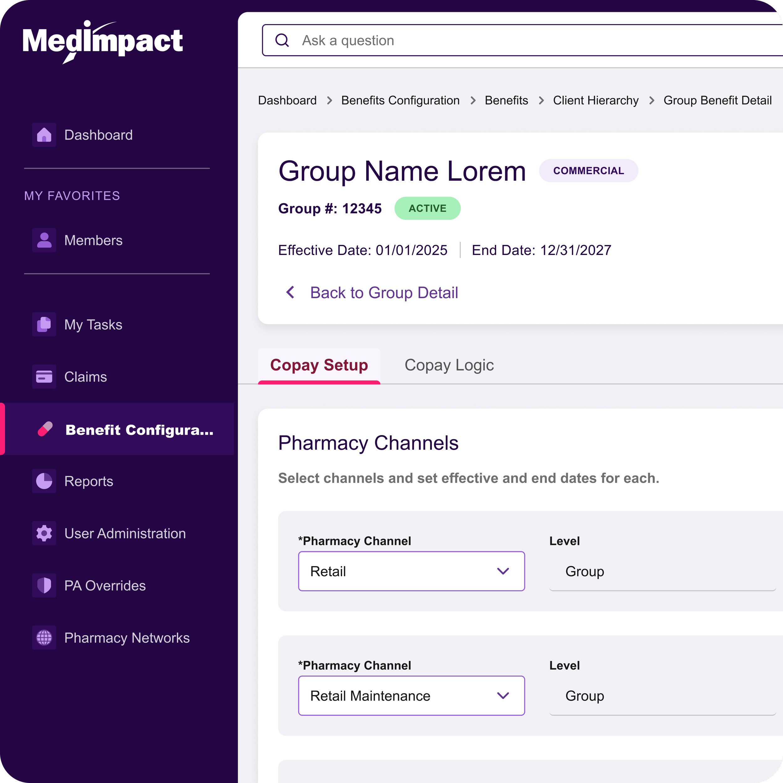
Configurator (Editor)
A single-page inline editor with a sticky header showing client name, and save actions. Seven pharmacy channel panels stack vertically. Each panel contains:
Channel header with effective/end dates and organization type (Drug Type or Tier).
Collapsible rule content with popovers for Increments, Amounts & Limits, and Rule Exceptions.
Channel-level exceptions accessible from a toolbar within each channel panel.
Locked rule sets for Drug Type channels and auto-numbered tiers for Tier channels.
Read-Only Summary
Accessed via the Group Details Copay tab. Uses two-level horizontal tabs (Channel → Rule) to eliminate long vertical scrolling. A dense table format presents day-supply ranges, cost ranges, exclusions, and limits in a compact, scannable layout.
Design System Contributions
Context popover pattern: Header always displays Channel and Rule context.
Dense read-only table: Optimized for reviewer scanning.
IMPACT
Quantitative Results
Median configuration time: ~45 min → ~14 min (-69%).
QA findings per config: Reduced by 52%.
Reviewer time-to-answer: ~40 s → ~8 s for targeted rule lookups.
Design phase compressed by an estimated 40% through Lovable AI-assisted prototyping.
Qualitative Feedback
Analyst: "The custom increments used to be where I made mistakes. Now the dialog keeps me honest."
What We Would Do Differently
Build the read-only view earlier in the process; reviewer needs surfaced late.
Add bulk-edit patterns for mass-updating effective dates across channels.
Explore copy-paste between channels for similar tier structures.
LEADERSHIP SIGNALS
Reframing the Brief
The initial request was for a wizard-based configurator. Through research, we reframed the problem around channel-first editing and a separate reviewer view — a structure that did not exist in any legacy tool.
Convincing Engineering
Advocated for locking rule sets rather than free-form addition/deletion. This reduced frontend state complexity and prevented an entire class of validation errors.
Systems Thinking
The two-level tab pattern and the dense read-only table were designed to generalize as reusable patterns across the MedCommand roadmap.
AI-Accelerated Delivery
Used Lovable AI to move from blank page to interactive, user-tested prototype in days rather than weeks. This shifted my role upstream — more time on framing, research synthesis, and stakeholder alignment, and less time pushing pixels.

Atlas One

Atlas Japan

Patient Management

Sales Rep Experience
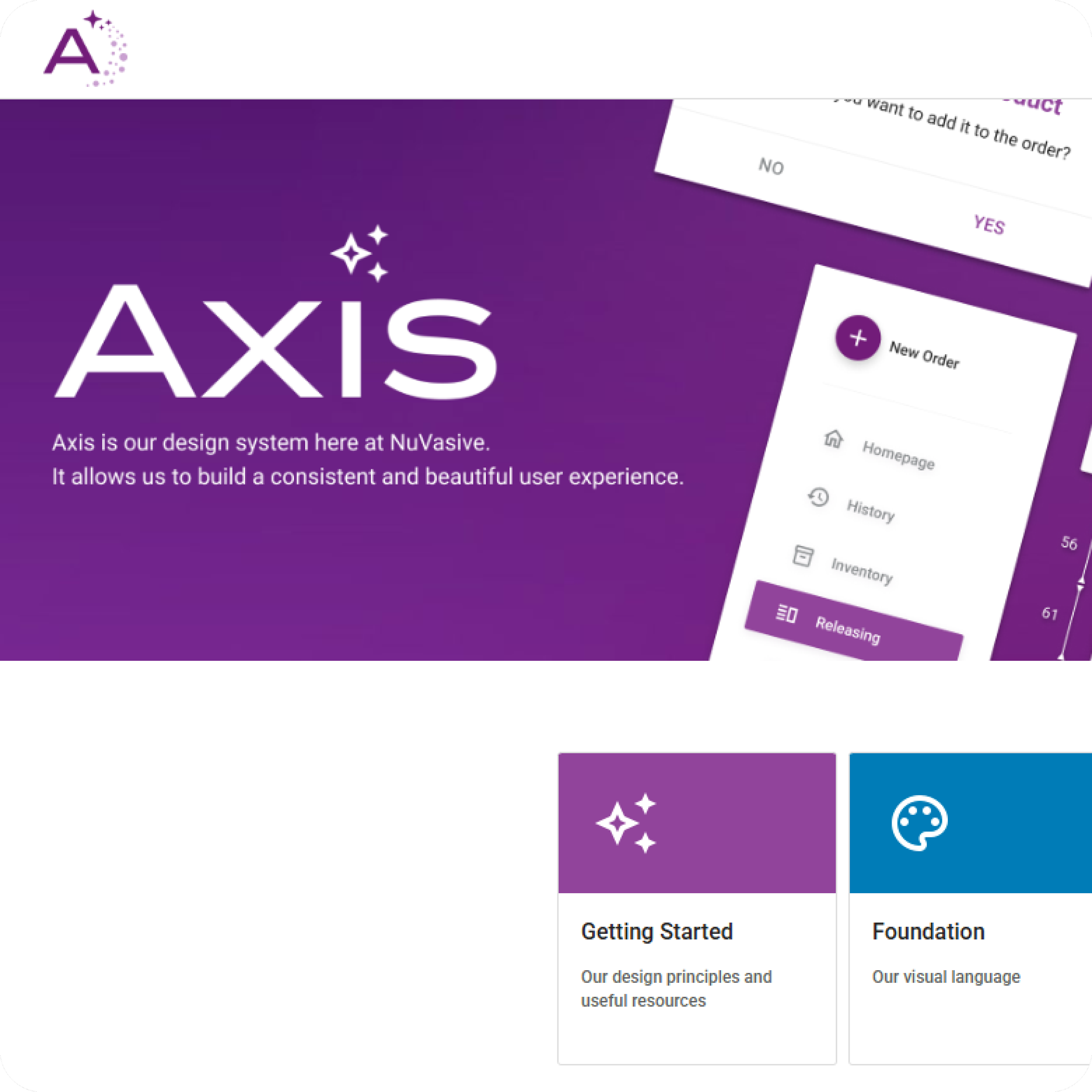
Axis Design System
Copay Configurator